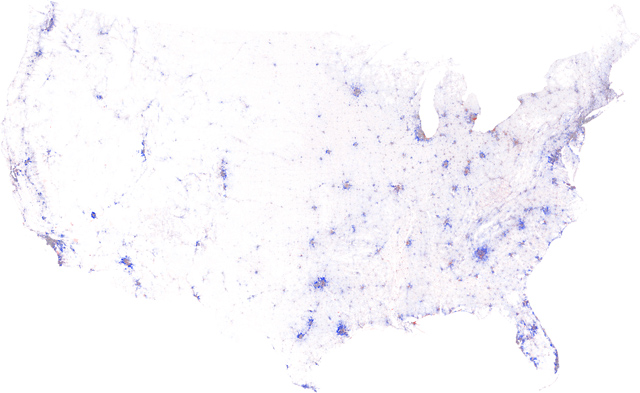
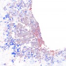
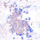
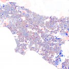
Whether by birth, storm, or interest-only loan, our nation’s population is perpetually shifting – from neighborhood to neighborhood and state to state – and now, Census data in hand, we present the past decade’s growth and decline as a series of high-resolution maps:
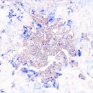
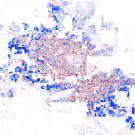
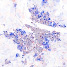
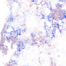
Above is the contiguous United States, color-coded by the change in population density from 2000 to 2010. In urban areas, deep blue indicates that the population doubled (or more), pure red means that everyone left, grey denotes no change, and the intermediate tones represent the spectrum of increases and decreases in-between. Below 5000 residents per square mile, these colors fade with the square root of density towards white, where no people lived in either year. We created these maps from the official U.S. Census 2000 and 2010 block-level population data and boundaries using custom-built cartographic software.
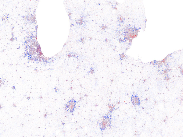
Nationwide, one feature stands out: the bumper crop of fresh suburbs that ring almost every metropolitan area. Where did all of these people come from? A zoom into the Midwest suggests the answer. The new tract developments appear to be sucking the life out the older neighborhoods, which bear the scarlet tints of waning population:
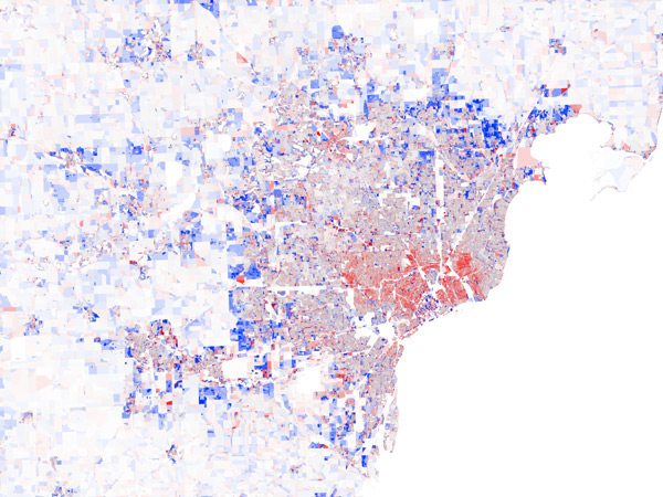
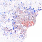
Ah, the classic flight to the suburbs, but with a twist! Click through and look closely, and at the very center of the biggest cities – within a stone’s throw of downtown – you’ll see a tiny, resurgent dot of blue. Apparently, at some point in recent history, a home address amongst the skyscrapers became desirable again. Even in the City of Detroit, which dropped a full quarter of its citizens in the last decade, downtown is flashing the signs of a comeback:
It’s easy to miss, but it’s there: a speckled blue island surrounded by a solid sea of red. So, yeah, Detroit is rough, but downtown Detroit… well, that must be the nice part that Eminem was cruising.
See maps of major metros and other interesting places, including a post-Katrina New Orleans and sprawling Las Vegas, below.
Update: We’ve added more maps!
