On this, the UN’s first-ever World Statistics Day, you’d expect the Internet to be overflowing with platitudes – about the value of censuses, government projections, and other such stuff. Instead, quite the opposite, the data blogosphere has Gone Wild!
Warning: some of what follows is NSFW.
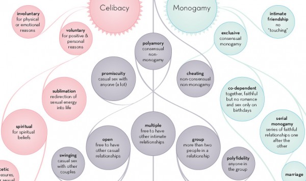
Information Is Beautiful starts things off, slow and seductive, with an update to The Varieties Of Intimate Relationship:
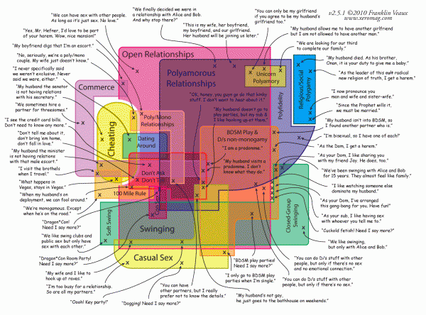
The main thrust of Version 2.0? To add some of the more risque varieties of human desire from Franklin Veaux’s Map Of Non-Monogamy:
Next, Flowing Data turns up the heat, imploring its readers to put more sensual spin on Indiana University’s National Sex Study statistics:
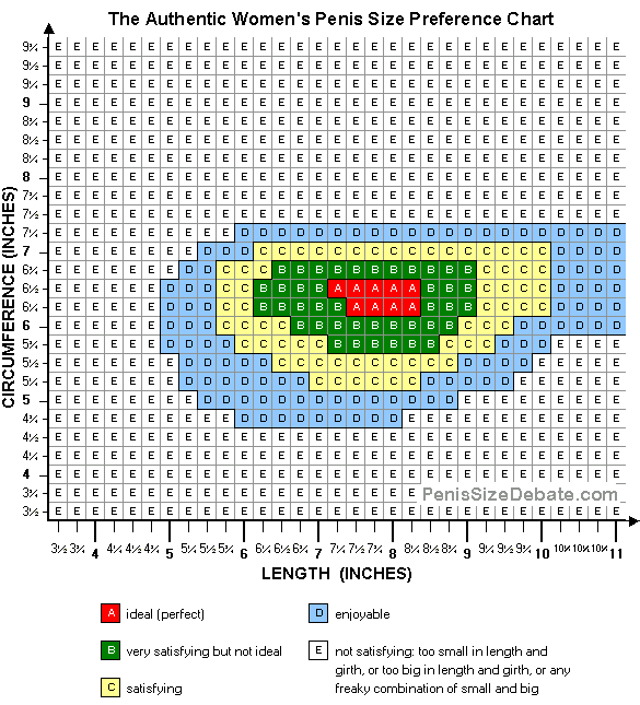
Then, the aptly-named Chart Porn joins in, exposing The Penis Size Debate’s graph of the length and girth that women prefer:
How do you – or your partner – measure up? Find out with this handy ruler:
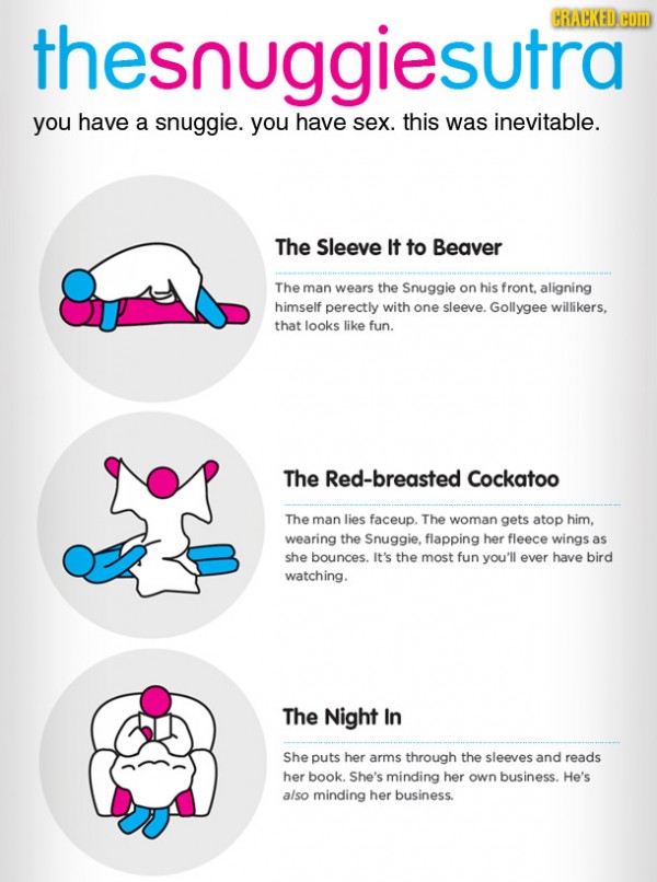
Finally, we come to fruition with the infographic that we’ve fantasized about for years:
If the Snuggie’s rockin’, the boots are a-knockin’!


