I’m an incorrigible data hound. So, once the tempting aroma of XKCD’s color name survey results tickled my nose, I had no choice – but to run to the dining room, stand up on my hind legs, and yank that statistical top sirloin off the table. Om nom nom yum yum yum!
For those unfamiliar, XKCD is the popular webcomic, and on its sister blog, author Randall Munroe announced his survey as follows:
I’d like your help for a color name survey! The survey shows you colors, and you type a name (word or phrase) you might use for that color. The names can be as broad or specific as you want.
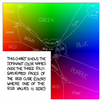
During the next two months, over 200,000 people named more than 5,000,000 random hues. Soon thereafter, Randall delivered a frequently side-splitting analysis of the results, artfully punctuated by his wonderful Color Map (pictured right): an illustration detailing the territorial dominance of each name in fully-saturated RGB space. The kicker was that the magnanimous Munroe made the individual survey responses – possibly the largest body of such information in existence – publicly available for anyone to use. Kudos for freeing the data, dude!
Now, deep in the cockles of my drama queen heart, there’s always been a little shrine for the colors with the charismatic, less-spoken names. Could periwinkle roll off the tongue more adorably? Maroon? Aye, there be pirates about! And yeah, burgundy and chartreuse do sound a bit boozy, but they’re hella more fun at parties than “dark red” and “yellow-green.”
Their Achilles’ heel? The lack of a verbal tether to the common colors, causing the occasional mix-up about what they mean. Case in point: until yesterday, I thought that khaki was an olive-type of green, but per my wife and other experts, it leans more towards beige and brown.
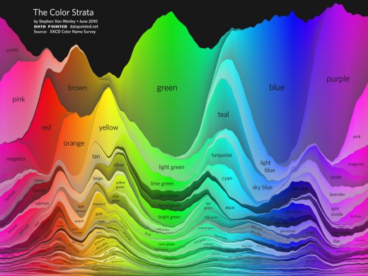
Egads! I’d been afflicted by the embarrassing scourge of color confusion! So that no one else should suffer it – or have to wear Dockers to know what “khaki” means – our design team went to work on a cure. The resulting visualization, borne of the XKCD data, shows the primary color names, their lesser-used brethren, and the relationship between them:
The Color Strata includes the 200 most common color names (excluding black-white-grayish tones), organized by hue horizontally and relative usage vertically, stacked by overall popularity, shaded representatively, and labeled where possible. Besides filtering spam, ignoring cruft, normalizing grey to gray, and correcting the most egregious misspellings (here’s looking at you, fuchsia), the results are otherwise unadulterated. As such, similar color names, like sea green, seafoam green, and seafoam, each appear separately. They’re synonymous… or are they?
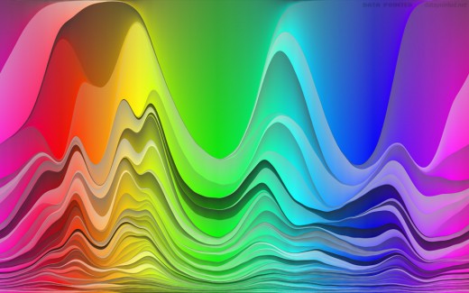
Anyways, once you’ve had your fill of that, bliss out on this:
It’s the same basic graph, but with flipped shading, label-free, stretched to fill the vertical, and whipped until creamy smooth.
Ahhhh. On that note, we conclude today’s episode of color research. Subscribe to stay tuned for more – we might even pull Crayola crayons back into the mix – coming soon.


